GBIF Data and 3D Printing
Ben Raymond ben@untan.gl
February 2015
Table of Contents
Background
Communication is a vital part of science, and visualisation of data and scientific results is a key part of that process. A visualisation should engage the audience, conveying the methods and results of the study and providing a conceptual link to real-world phenomena and processes. 3D printers are now cheap and becoming widely available, including in schools and higher education institutions, and could potentially be used to create novel, engaging, physical representations of data.
The aim of this submission was to explore ways of transforming GBIF-sourced data into 3D-printed representations, as a novel approach to data visualisation. Two examples are provided that might be considered to be representative of many science-communication scenarios.
Example 1: Spatial relationships between deer species
The spatial distribution of a species is influenced by interactions with other species1. One species may depend an another (a predator and its prey, or a parasite and its host), or both may depend on each other (mutualism). In contrast, one species may exclude another, for example by competition for resources.
The aim of this example was to choose two species with spatially-complementary spatial distributions, and produce a 3D visualisation that relationship. This might be useful in educational or conservation-management contexts, illustrating the outcome of processes such as competition or invasion. Mule deer Odocoileus hemionus and the closely-related white-tailed deer Odocoileus virginianus are used here. These species are indigenous to North America, and their interactions and relative distributions have long been of interest2.
Source code
The R code for this example is available along with the STL files for printing. Note on the code for users not familiar with R: if you get errors saying "there is no package called blah" then you just need install the package: install.packages("blah").
The method is summarised below.
Data processing
The data processing was done in R, using the rgbif package for retrieving data from GBIF. The first step was to retrieve a set of occurrences from GBIF. Records were restricted to North America via the continent parameter in the API call. A quick plot of the O. hemionus and O. virginianus records as a check:
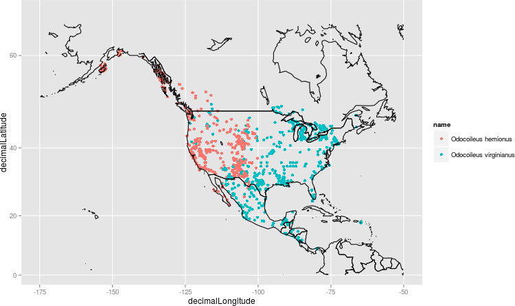 |
Looks encouraging!
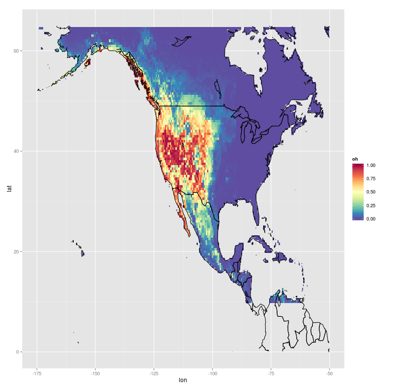
However, in order to create physical representations, continuous species distributions are required, rather than point observations. The occurrences were therefore used along with bio-climatic data to model the spatial distributions of the two species. The two species were modelled separately, using bio-climatic data obtained from WorldClim. Although only two species are of primary interest here, occurrence records for all deer (Cervidae) were used for this step, because the presences of other species (e.g. reindeer and moose) can be used to infer absences of the two target species.
These layers were used with random forest classification models, giving the probability of occurrence of each of the two species across the area of interest:
 |
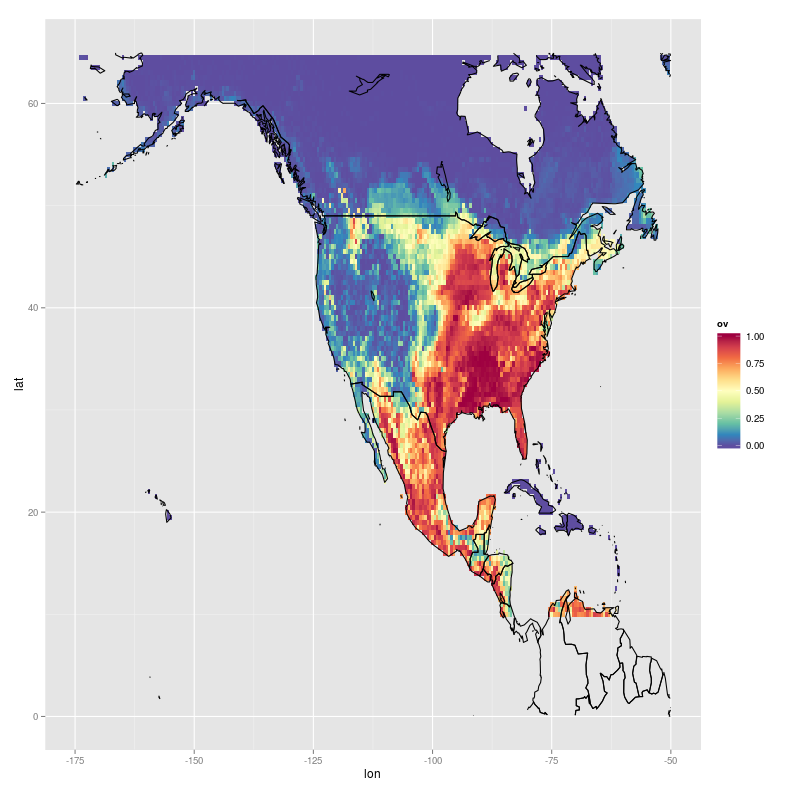 |
| Odocoileus hemionus predicted distribution | Odocoileus virginianus predicted distribution |
The STL files required for the 3D printing were produced from these distributions using the r2stl package. The STL files were scaled appropriately using the Blender software, then passed to Slic3r to produce the g-code that actually instructs the 3D printer how to build the object.
Model results and interpretation
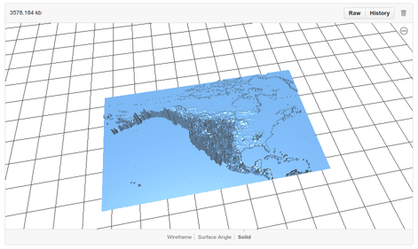
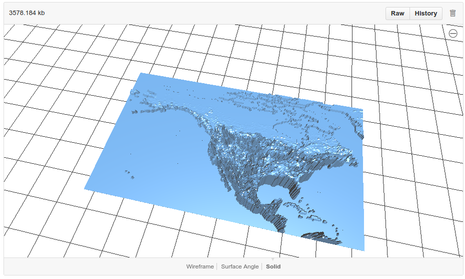
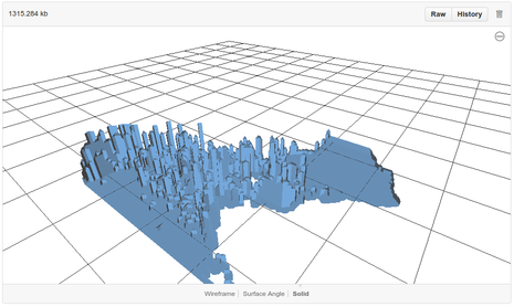
The STL files can be visualised using github's built-in STL viewer:
 |
 |
| Click for interactive versions |
Ignoring the baseplate and land masses (which provide the spatial context), the height of the plastic is the estimated probability of occurrence of the species at the location in question. That is, exactly as with a normal species distribution, but with probability mapped to the vertical dimension.
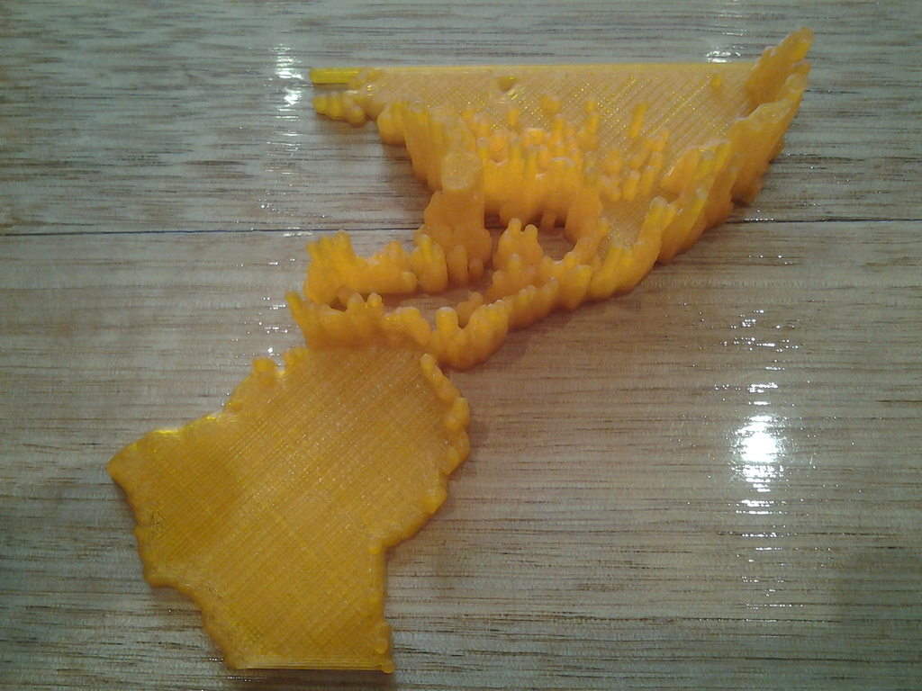
Test print
 |
| Odocoileus virginianus, 50mm x 50mm using PLA plastic |
Final prints
The final prints were made in ABS plastic. To improve visual interpretability, the "distribution" part of each print was printed in a differently-coloured plastic to the reference material (land masses and base plate). The printer had only a single extruder (i.e. capable of printing only one colour at a time), so this required printing the two parts in separate steps, changing the filament in between.
The printing process in action (if only it was this fast in real life: the video has been speeded up 100 times):
The final prints:
 |
 |
| Odocoileus hemionus (left) and O. virginianus. Two-colour prints, 90mm x 50mm using ABS plastic. Click for larger versions. |
Limitations and biases
Initially it was hoped that the 3D representation would allow a viewer to see the finer details of the complementarity of the two distributions (i.e. focus in on where they overlap and where they are separated in space). Having the two distributions on separate prints does not really lend itself to this comparison to the degree that was hoped. An alternative representation that somehow enables that comparison would be worth investigating (possibly "jigsaw"-style prints that could be fitted together, or printing one of the two upside-down so that it can be placed over the top of the other one).
The predicted species distributions used here may not be particularly accurate: the environmental predictor variables used were selected largely for convenience, rather than based on any particular ecological insights. Refinement of these models would give more realistic results (but it seems reasonable to expect that the overall picture of largely-complementary spatial distributions would remain much the same).
Example 2: Brown pelican recovery
The brown pelican Pelecanus occidentalis is a well known example of a successful species recovery. In the 1970s, pesticides caused their egg shells to thin, resulting in widespread breeding failure and a dramatic drop in population numbers in the United States. DDT was banned and birds were reintroduced to parts of the US. The species recovery was such that it was removed from the US Endangered Species list in 2009, and has been listed as Least Concern on the IUCN Red List since 1988 (see http://en.wikipedia.org/wiki/Brown_pelican).
Here, the intention was to characterise the change in spatial distribution of this species over the course of its re-establishment.
Note on source code
The code for this example was written in Matlab, and will be ported to R and published when time allows. In the meantime, the STL file is available.
Data processing
All brown pelican occurrences were downloaded from GBIF (315,926 records from 118 datasets3). This was done through the GBIF portal rather than the API, due to the large number of records. Occurrences were grouped into 5-year periods, starting from 1960.
The spatial distribution of occurrence records within each 5-year time slice was then used as an an estimate of the spatial distribution of the species during that period. The geographic coordinates of each record were rounded to the nearest degree of latitude and longitude, giving a grid with cells of 1-degree resolution.
In principle these layers can simply be stacked on top of each other, producing a representation of the spatial distribution over time (where the vertical axis is time). However, this will give an object that can't be physically printed, because it will have unsupported elements (e.g. if the species was present in a grid cell at a certain time, then absent in the next time slice, and then present again, it will cause a vertical gap in the plastic, which won't work without an exemption from gravity — or a dual-extruder printer, as discussed below).
Some small artistic licenses were taken to remove these issues: firstly, for each grid cell, an isolated absence (i.e. a 5-year period where the species was absent, but present in surrounding time periods) was replaced with a presence. The justification for this is that the absence is more likely to be due to lack of survey effort during that time, rather then a true absence of the species (see more discussion of survey effort issues below). Secondly, two or more absences in succession were taken to indicate genuine absence of the species from the location during that decade. The data record for that grid cell was then truncated at that time (i.e. any presences prior to that time were discarded). This change means that the final representation is focused on the re-establishment phase of the species (i.e. it will not show the species disappearing then re-establishing in any grid cells) — but in fact the difference is fairly subtle: this change affected less than 5% of grid cells.
Finally, a base layer showing the relevant parts of North and South America was added to provide the spatial context.
Model results and interpretation
 |
| Click for interactive version |
The vertical axis of the print represents time, with the tallest point corresponding to 1960 and the lowest point (i.e. at the land-mass layer) corresponding to the most recent data. The physical structure is more horizontally-extensive at the bottom, showing that the species was more widespread in range in more recent years. The top of each column indicates the time at which the species re-established at that location. Columns that span the full height of the model, indicating that the species was present throughout the whole time period, are relatively scarce. The most southerly records along the coast of South America as well as records in the USA interior appear only in recent years, suggesting either continued range expansion or greater survey effort (or reporting) in recent years.
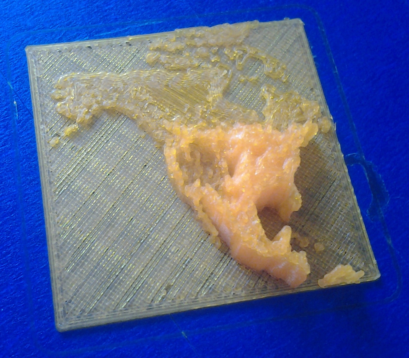
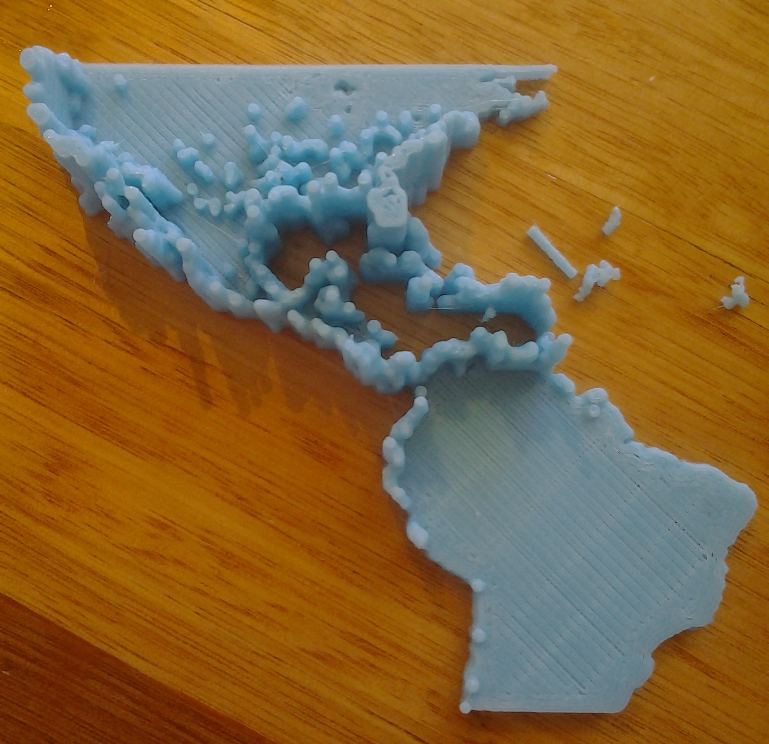
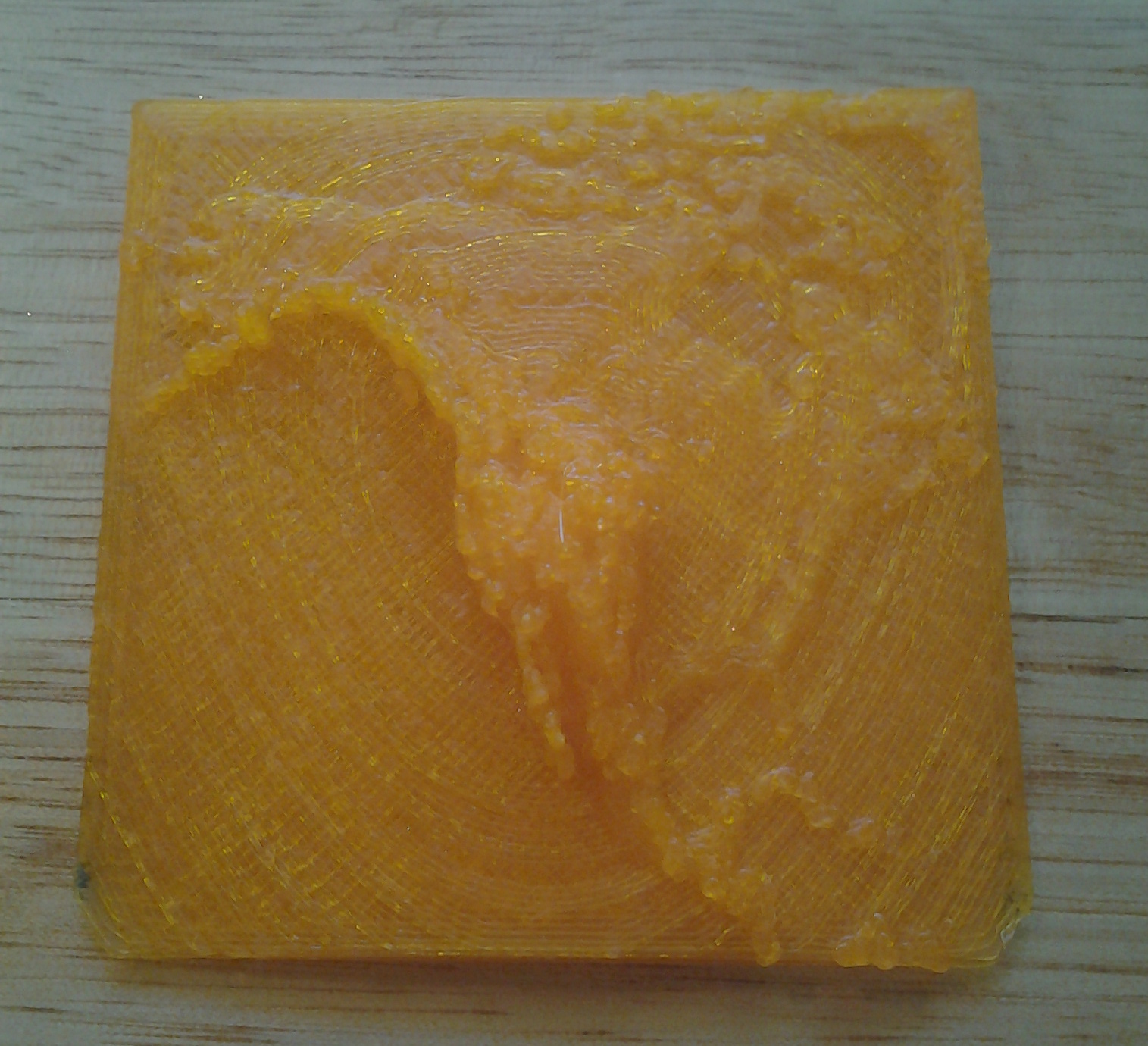
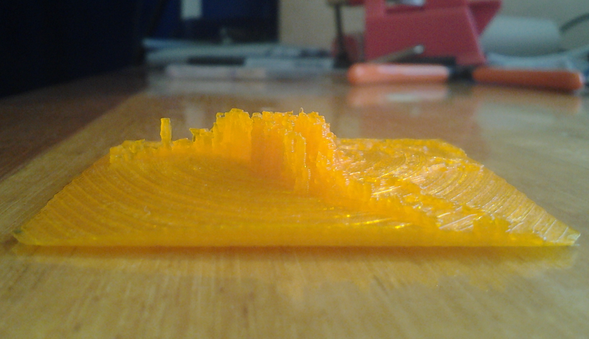
Test prints
 |
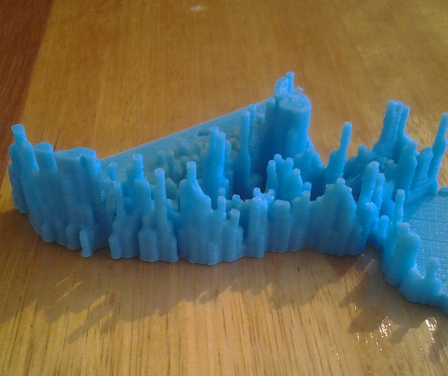 |
| Test print, 85 x 90 mm using PLA plastic (fragile; note the broken-off pieces to the right) | Structure along the US west coast. |
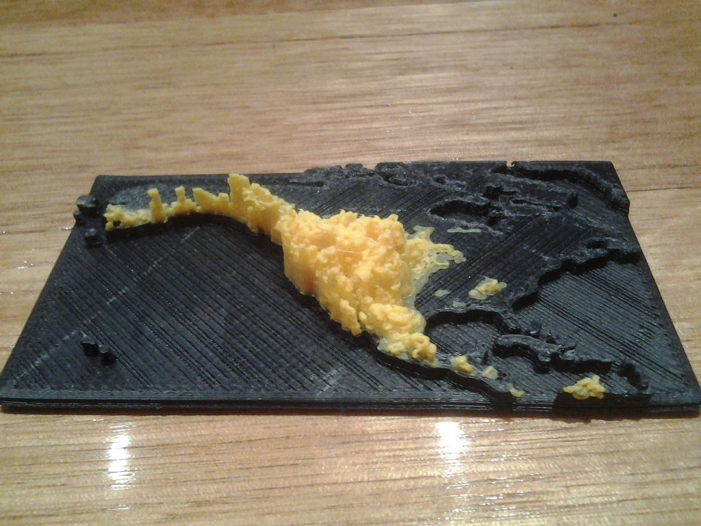
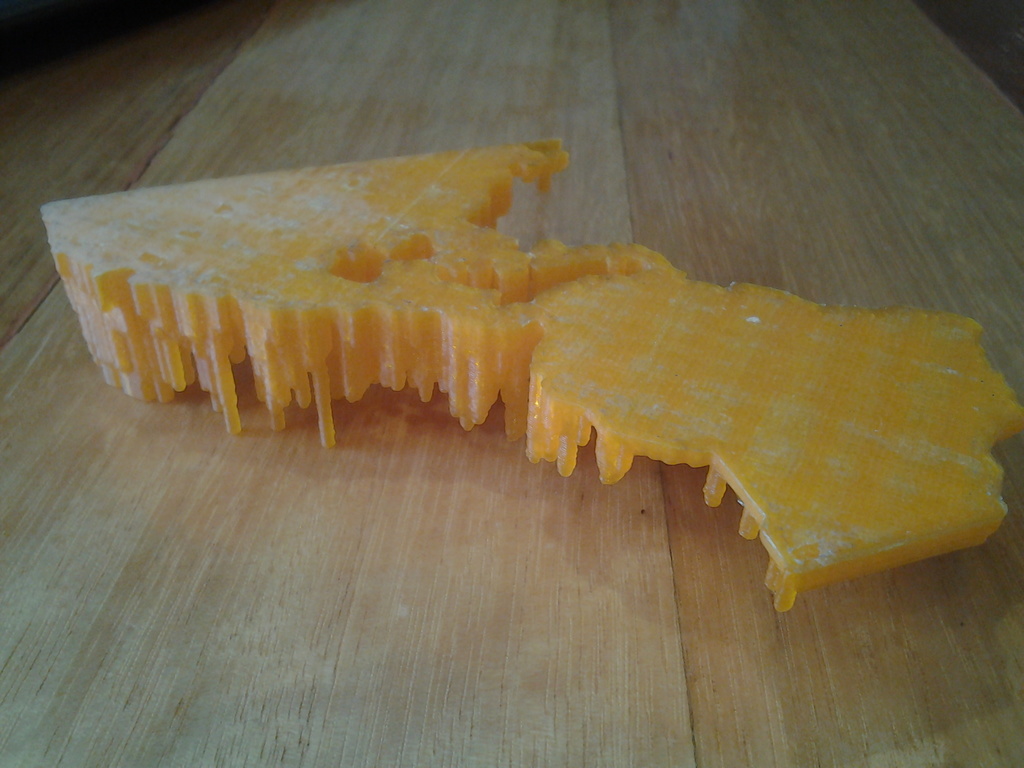
Final print
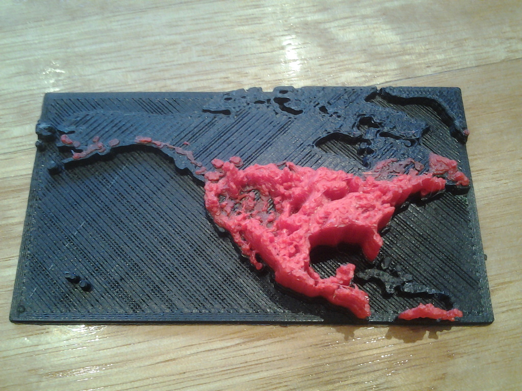
For the final print, ABS plastic was tried because it is less brittle than PLA, but unfortunately had excessive warping (a common issue with ABS). PLA was used, at a reduced horizontal resolution (hence thickening the fragile columns).
The vertical axis was reversed so that time increases upwards, which is more consistent with our expectations (rather than time increasing downwards as in the test print). This does mean that the land-mass layer is uppermost with the time-structure hanging downwards, which is somewhat unintuitive. Using a transparent plastic layer for the land masses might be helpful here. Printing the different 5-year periods in different colours would have been a great way of drawing attention to the changes over time, but couldn't be done in time for this submission.
 |
 |
| Final print, 85 x 90 mm using PLA plastic |
Limitations and biases
Since the raw occurrence records are used to estimate species distribution, it is likely that changes in survey effort and reporting over time are confounded with changes in species distribution over time. In this case, survey effort is likely to have increased over time alongside the population recovery, and so the resulting temporal pattern is a combination of the two processes. Modelling might be able to reduce the effects of this issue, but would almost certainly require data on survey effort over time (e.g. species absences, not just presences). A means of accommodating dispersal into the model would also be needed, rather than using a simple distribution modelling method that assumes that the species is in equilibrium with its environment: this is clearly not the case here.
Room for improvement
Both examples need more work, and other datasets and representations might lend themselves better to 3D printing.
Improvements to the code would help produce STL files that are less likely to require manual tweaking before printing, particularly for multi-coloured prints where different colours are printed in separate parts. Multi-coloured prints improve the interpretability of the results, but in their most general form require a multi-extruder printer. In some cases multiple colours can be achieved by changing filament mid-print, or by printing parts separately and bonding them together. A dual-extruder with transparent plastic as one of the materials could also be used to print objects requiring support material (i.e. supporting isolated pieces of plastic with the transparent material).
A simple cartesian grid was used in both examples here. Using projected coordinates would be a relatively trivial extension. However, map projections are designed to provide two-dimensional representations of the three-dimensional surface of the Earth, and we are printing in three dimensions! It would be nice to avoid flat-world representations entirely. A first attempt (with only moderate curvature) did not work particularly well — the visual artifacts resulting from the curvature of the print tended to overwhelm the meaningful detail of the model. A larger print would help (by making the step heights in the curvature smaller relative to the model detail), as might post-print smoothing by sanding or using acetone or similar treatment.
 |
 |
Source code and printing your own
The STL files of these objects are available, along with the R code required to reproduce the deer example.
Those with access to a 3D printer can produce their own physical copies of these objects from the STL files provided.
No 3D printer? You can submit files to commercial printing services such as Shapeways, who will print the object and mail it to you. Or you could try using Lego. LSculpt will take an STL file and convert it to a buildable Lego model.
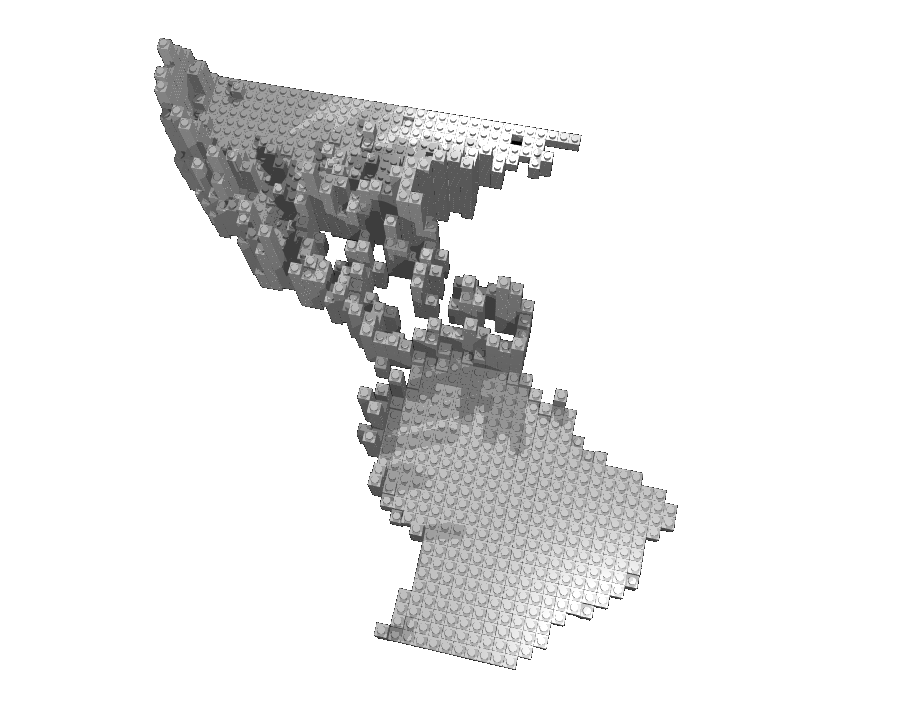 |
| Lego model from the brown pelican STL file |
Or perhaps use BrickIt to convert a raster representation of your data (a species distribution, perhaps) to a Lego mosaic.
Summary and science value: was this actually useful?
3D-printed representations of data are limited in the sense that they can only ever depict a fixed representation of a given data set. They can't be dynamically adjusted in the way an interactive digital display can. However, the tangible nature of a 3D printed piece makes it a brilliant communication tool for education and outreach, or as a conversation starter between scientists. Being able to hold the object in your hands and examine it from every angle is an experience that can't be fully reproduced in a digital environment. 3D-printed parts are easily handed around within a large audience, where digital methods may be less effective, and 3D printers are more likely to be available to educators and communicators than immersive digital data interaction technologies.
Footnotes:
Holt RD (2001) Species coexistence. In: Encyclopedia of Biodiversity 5:413–426. http://people.biology.ufl.edu/rdholt/holtpublications/105.PDF
For example: Anthony RG & Smith NS (1977) Ecological relationships between mule deer and white-tailed deer in southeastern Arizona. Ecological Monographs. http://dx.doi.org/10.2307/1942517
GBIF.org (15th February 2015) GBIF Occurrence Download http://doi.org/10.15468/dl.ttkrky