
3D Printing for Data Visualization
2017-05-28
Communication is a vital part of science, and visualisation of data and scientific results is a key part of that process. A visualisation should engage the audience, conveying the methods and results of the study and providing a conceptual link to real-world phenomena and processes. 3D printers are now cheap and becoming widely available, including in schools and higher education institutions, and can be used to create novel, engaging, physical representations of data.
See also this entry into the 2015 GBIF Ebbe Nielsen Challenge.
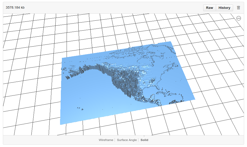
Examples
Topography — BEDMAP2
The BEDMAP2 data set that details the bedrock and overlying ice sheet of Antarctica.


Topography — the Totten Glacier region of East Antarctica.
Species distributions
(Click for interactive version)
Environmental patterns and processes
The seasonal growth and decay of sea ice around Antarctica (right). Looking from the top, you can see the hole in the shape of Antarctica. The surrounding material is the sea ice zone. The vertical axis of the figure is time, which spans one year from the bottom of the figure to the top. Moving upwards from the bottom (the start of winter) the sea ice grows to its winter maximum then decays away, leaving holes in the sides of the figure during summer where the sea ice has melted and left the coastline of Antarctica open to the ocean. The sea ice begins re-forming again towards the top as summer wanes and the ocean re-freezes.