
Characterizing volleyball part 1 - comparing international competitions
2024-01-26
Adrien Ickowicz, Ben Raymond
It is always an interesting exercise to try and predict how performances at youth and junior level translate into senior level. It is also interesting to have an idea of the main features of volleyball that are expected in a given competition, from historical data.
What we are questioning here is not so much the predictive analytics, but rather trying to identify if there is indeed a distinction between the different age group and / or the different competition and continents. And if so, what is it? To assess that, we run a statistical analysis called Principal Component Analysis on a number of competitions and with a number of indicators reflective of the competitions, and see if we can cluster these in groups.
Data
We used as many scouted files from the games as possible, as per Table 1 below. Unfortunately we could not get our hands on any African volleyball data, but we do have coverage for many age groups for South America, North America, Asia, Europe and World competitions, and many games for each category. While we were generally unable to get access every game in every competition, we have only included competitions in which we had a reasonable fraction of games, so as to be confident that the data gave a reasonable reflection of the standard and characteristics of play.
The table describes the different competitions we were able to include in the analysis, the number of teams that participated, and the number of games we accessed for each competitions.
| The analysed competitions | |||||||
| Summary of games and teams analysed through the shared scouted data. Not all games within the competitions had available scouted files. | |||||||
| Age group | Gender | Continent | Year | Games | Teams | ||
|---|---|---|---|---|---|---|---|
| AVC | AVC Senior Men 2022 | Senior | Men | asia & oceania | 2022 | 20 | 19 |
| AVC U16 Men 2023 | U16 | Men | asia & oceania | 2023 | 16 | 11 | |
| AVC U18 Men 2018 | U18 | Men | asia & oceania | 2018 | 7 | 9 | |
| AVC U20 Men 2022 | U20 | Men | asia & oceania | 2022 | 27 | 17 | |
| CEV | CEV Senior Men 2021 | Senior | Men | europe | 2021 | 16 | 20 |
| CEV U17 Men 2021 | U17 | Men | europe | 2021 | 17 | 17 | |
| CEV U18 Men 2022 | U18 | Men | europe | 2022 | 18 | 16 | |
| CEV U20 Men 2022 | U20 | Men | europe | 2022 | 20 | 18 | |
| CSV | CSV Senior Men 2021 | Senior | Men | south america | 2021 | 9 | 6 |
| CSV U17 Men 2023 | U17 | Men | south america | 2023 | 9 | 6 | |
| CSV U19 Men 2022 | U19 | Men | south america | 2022 | 10 | 10 | |
| CSV U21 Men 2022 | U21 | Men | south america | 2022 | 8 | 11 | |
| FIVB | FIVB U19 Men 2021 | U19 | Men | world | 2021 | 29 | 20 |
| FIVB U19 Men 2023 | U19 | Men | world | 2023 | 45 | 20 | |
| FIVB U21 Men 2021 | U21 | Men | world | 2021 | 20 | 20 | |
| FIVB U21 Men 2023 | U21 | Men | world | 2023 | 31 | 22 | |
| FIVB Senior Men 2018 | Senior | Men | world | 2018 | 94 | 25 | |
| FIVB Senior Men 2022 | Senior | Men | world | 2022 | 37 | 25 | |
| NORCECA | NORCECA Senior Men 2021 | Senior | Men | north america | 2021 | 13 | 9 |
| NORCECA Senior Men 2022 | Senior | Men | north america | 2022 | 26 | 13 | |
| NORCECA Senior Men 2023 | Senior | Men | north america | 2023 | 17 | 12 | |
| NORCECA U19 Men 2023 | U19 | Men | north america | 2023 | 11 | 8 | |
| NORCECA U21 Men 2023 | U21 | Men | north america | 2023 | 13 | 9 | |
| Source: Courtesy of Lionel Bonnaure and the many scouts worldwide for sharing their scouted files. Sourced from VB Canada’s scout share server. | |||||||
The data only goes back to 2018 (two competitions), and the rest from 2020 until 2023. The redundancy of the FIVB competitions (2 U19, 2 U21 and 2 seniors) should also allow us to evaluate the consistency of these competitions in terms of the key statisitical descriptors.
Key statistics
Anyone familiar with volleyball, or sport really, knows that many numbers can be derived from any games. These numbers are then used in a number of ways, Moneyball being one example. At Science Untangled, amongst our suite of apps used to analyse any given game, there is one you can access (there https://apps.untan.gl/dvrr/) which gives you access to range of metrics. The Analysis summary tab in particular provides a number of statistical metrics that we are going to use in this article. The key statistics that we decided to include in the analysis are:
- Sideout rate
- Rate of positive or perfect receptions
- Rate of reception errors
- Kill rate of attacks of reception phase
- Kill rate of attacks of transition phase
- Overall attack kill rate
- Counter attack rate (percentage of opposition attacks on which a counterattack was made. Only opposition attacks on which there was a defensive opportunity are included - i.e. not block kills or invasions, and not attack errors or attacks that were recycled back to the attacking team)
- Rate of first ball sideout
- Rate of serving errors
- Errors per 100 pts, including and excluding serving errors
- Variability of sideout rate per rotation
The tab actually provides more than 70 different metrics. We deliberately only focus on the 12 indicators described above to keep it high level. You can check the values for the different competitions in Table 2.
While we are by no means covering every aspect of the game, this should give us a good idea of general tendencies. Further analysis can then be performed following the direction provided by this early approach.
Method
Even though we’ve restricted ourselves to 12 measurements, this is still way too many to visualize directly. Ideally we’d like to summarize this data down to two three dimensions, so that it can be plotted and the differences between the competitions visualized more easily. To do this we use a method called principal components analysis. This is a well-known statistical technique to capture the most important information from high-dimensional data. It relies on the fact that many of the variables will be correlated with each other (i.e. when one increases, so does another). We can combine those correlated variables into new composite variables, called “principal components”, leaving us with a smaller number of variables that still capture the main patterns in the original data. For a technical explanation of how this is done, see e.g. the Wikipedia page.
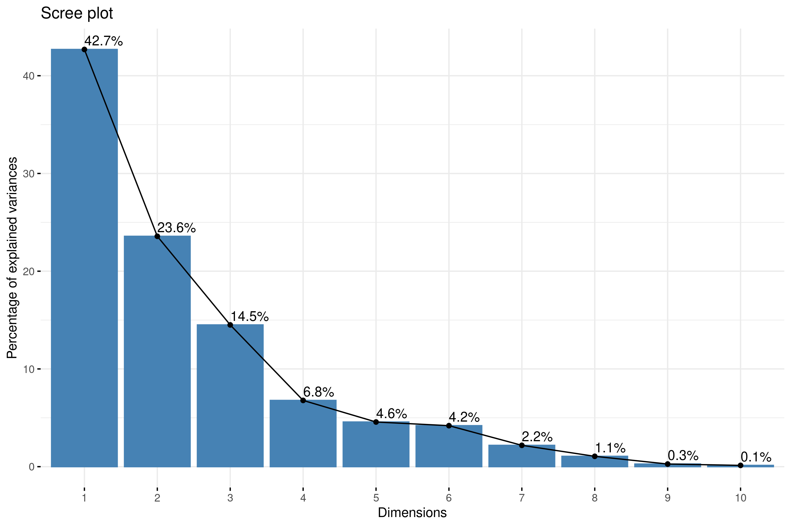
In the histogram above, we can see the quantity of information provided by the different components is steadily decreasing. The 1st component explains about 43% of the competitions difference, then it goes down to about 24%, then 15%, etc. The components are actually calculated so that they explain different aspects of information, so as you keep many components, you can add the percent of information they cover. The first three components can be considered to be the most significant since they contain almost 81% of the total information of the data. The remaining components each add only a small additional amount of information, so we keep with the first 3 components as a balance between explaining as much as possible and keeping it simple.
So, with keeping 3 components, we need to also understand what these three components represent (remember that each of these components is some combination of our original variables). This is what the figure below helps doing. Within each circle, the original key statistics are represented, and their coordinates mark their relative importance.
Three main pieces of information can be observed from the axis plot below:
- First, all the variables that are grouped together are positively correlated to each other, and that is the case for instance for ATT KILL%, REC ATT KILL%, SO% and FBSO%.
- Then, the further a point is from the centre of the plot, the better represented that variable is. From the biplot, ATT KILL%, REC ATT KILL%, and SO% have higher magnitude compared to TRANS ATT KILL%, and hence are well represented compared to TRANS ATT KILL%.
- Finally, variables that are negatively correlated are displayed to the opposite sides of the biplot’s origin (for example REC %POS+PERF and REC %ERR, meaning that when the rate of positive/perfect reception increases, the reception error rate decreases, as you’d expect).
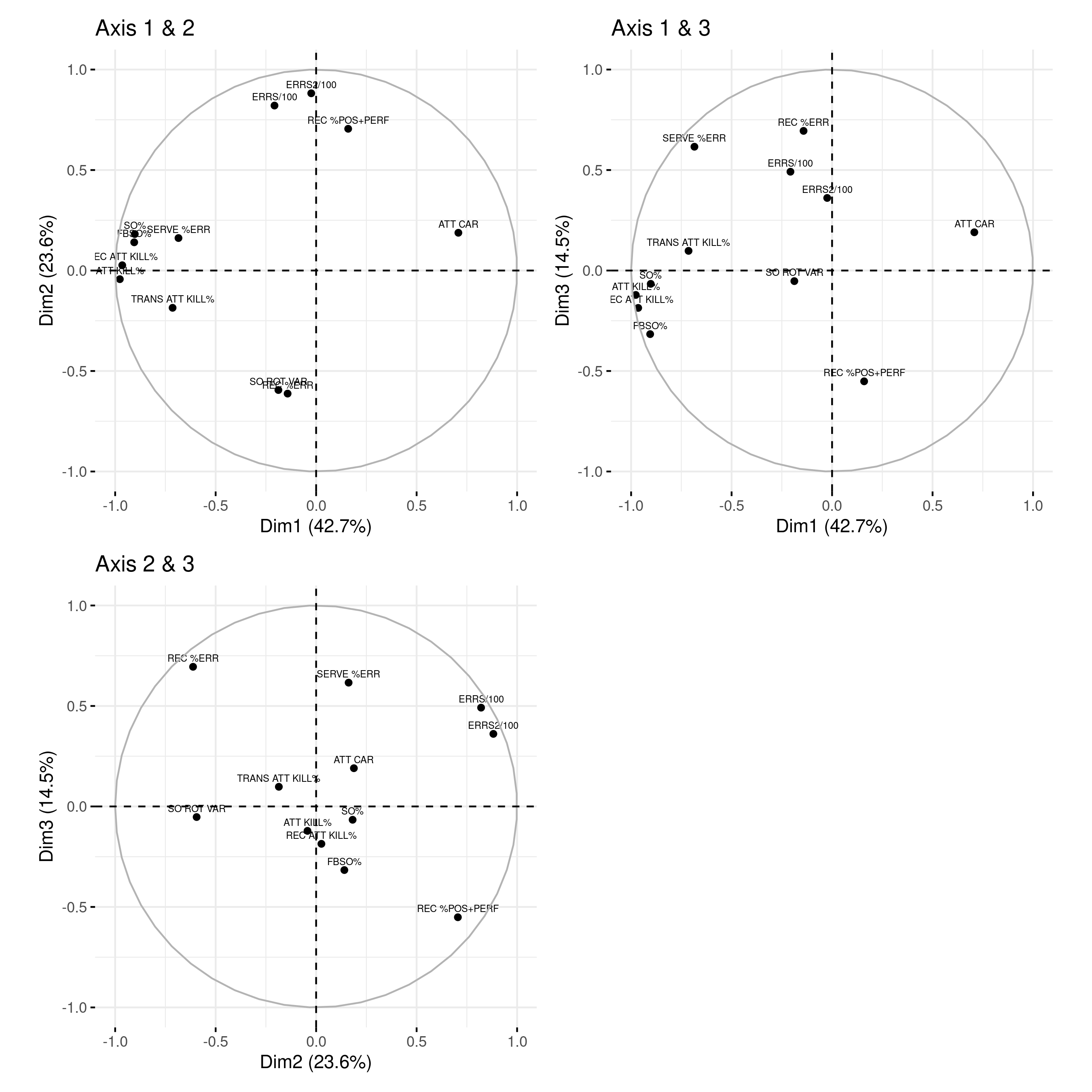
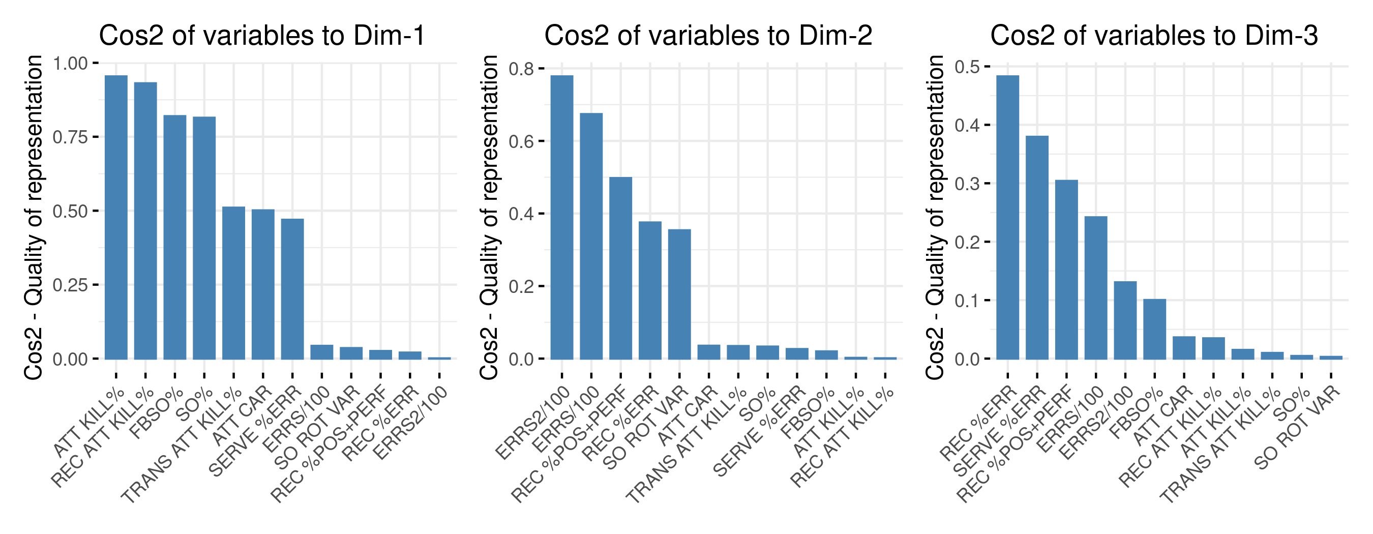
The goal of the third visualization is to determine how much each variable is represented in a given component.
- A low value means that the variable is not perfectly represented by that component.
- A high value, on the other hand, means a good representation of the variable on that component.
With these explanation, here is what can be said from each component:
- Component 1 is dominated by attack kills, mainly of reception phase, and siding out. By virtue of signs and directions low values along this component mean that a competition is defined by high sideout rate, including on first ball, and high attack kills;
- Component 2 is defined by the number of errors per 100 pts, including or excluding serving errors. A high value along this axis means high errors per 100 pts, or also high quality receiving.
- Component 3 is defined by serve and reception error, as well as passing quality (% of perfect and positive). A high value along this axis means a low receiving quality and / or high reception and serve errors.
Competitions positioning
Having established our principal components, we can project each of our competitions onto these new axes, and examine how they compare to each other. This is shown in the figure below (these are two-dimensional plots, so we plot axes 1 and 2 together in the first plot and axes 1 and 3 in the second plot). The figure is telling us that:
- Attack kill rate and sideout rate are getting higher as athletes are getting older;
- Asia’s and North America’s under age competition have the best passing quality (or the least aggressive serving, as they also seem to have the least serve errors)
- FIVB world championship events, regardless of age, are very much high range in terms of errors;
- Senior Eurovolley is probably the closest to Senior World Champs than any other senior competitions;
- The FIVB events (low pointed triangles) are quite consistent within their age group (FIVB U19 2021 and 2023 are fairly similar, so are FIVB U21 2021 and 2023, and FIVB Senior 2018 and 2022);
- The CSV (South American) events across age groups look to be consistently in the lower range of each axis (albeit neutral error rate) compared to other confederations. AVC’s are very variable, so are NORCECA’s, while CEV’s seem better at sideout and attack kill rates.
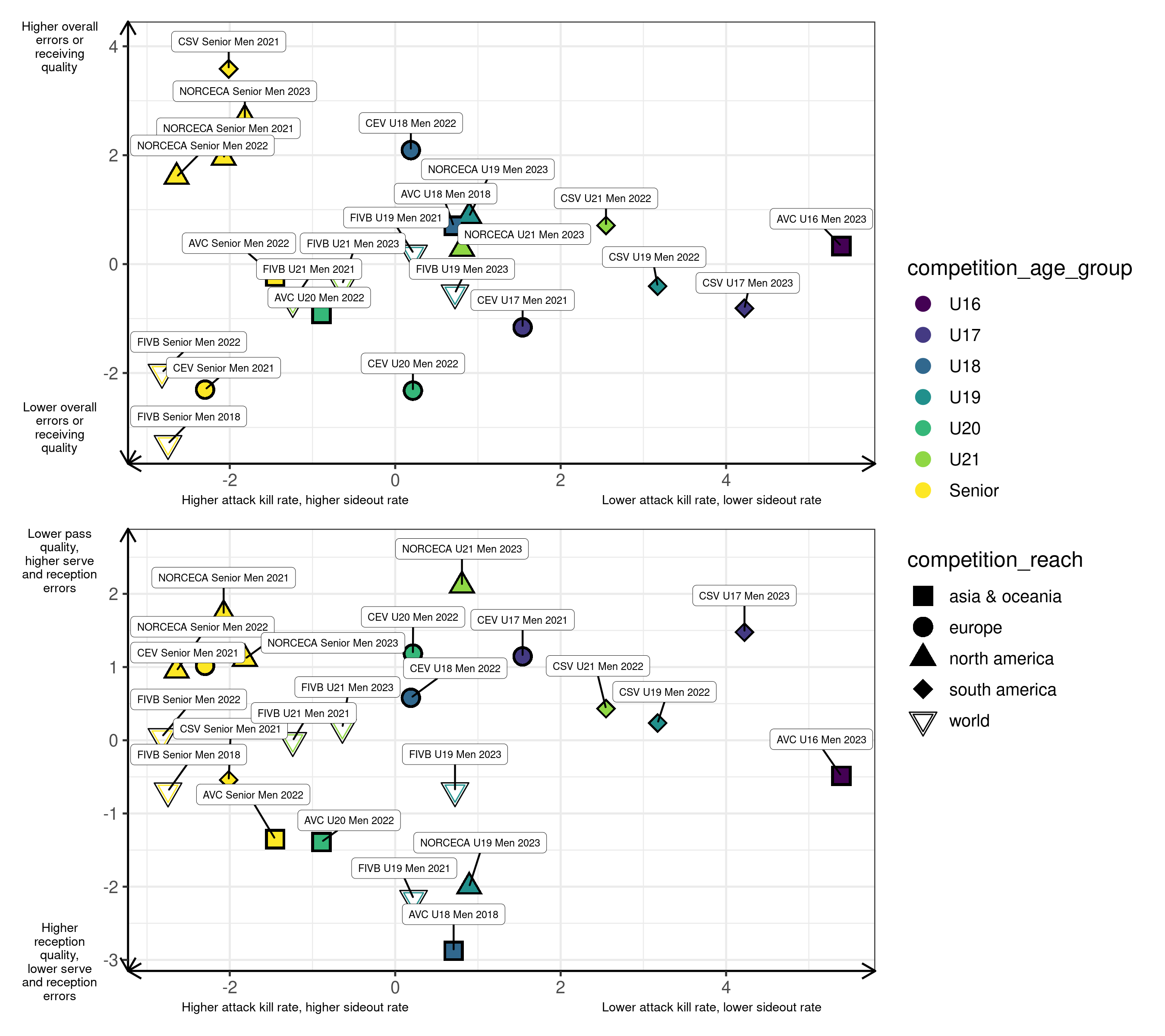
We can also present the same information on a single 3D plot, rather than two 2-D plots. Below is a 3D plot to help navigate the difference in 3 dimensions. Click and drag the plot to rotate it, and scroll to zoom.
Discussion
This analysis is not the right way to go about evaluating a given team’s performance in a competition, in particular when there is no full round robin where everyone gets a chance to play everyone else. It is however telling us how different the overall standards of play between competitions can be, and how much variability can be expected across competitions. Bear in mind that the key statistics for a team are influenced by what their opponents do, and so making conclusions about the ‘quality’ of one competition over another is not warranted. But one can say what are the aspects of the game that seem to have priority in the different confederations.
The next article will lead us to dig into the within-competition variability.