
Ben Raymond
There are many approaches and tools for visualizing taxonomic, phylogenetic, and similar data. Why another one? Just for the fun of it, really.
Inspired by Paperscape, we wanted to create a visualization that simultaneously conveyed the vastness and diversity of life, while allowing the user to zoom in to fine-scale structure. The process was, roughly:
- grab a suitable chunk of taxonomic data from the Atlas of Living Australia, using their "download taxa" web service
- compute the visualization layout. Each node (circle) in the visualization is a taxonomic leaf node (i.e. a species or subspecies). The layout is hierarchical, so that species with a genus are placed near each other, then genera within a family are placed together, and so on up the taxonomic tree. At each step we used a circle-packing method, and then the overall layout was compacted and refined using a force-directed algorithm. This is a similar approach to this d3 example. We used Matlab and d3 for these computations
- render the layout to a series of images. For this, we used Processing. The colours of the nodes also convey taxonomic information: broad taxonomic groups are assigned unique starting colours. As we descend into finer taxonomic levels within the group, the colour is given a small random nudge, so that nodes within the group end up with a range of similar colours. This roughly conveys taxonomic similarity, but also just looks more pleasing than blocks of identical colour
- finally, the Leaflet javascript library provides a nice framework to allow the user to pan and zoom through the layout. It's designed for interactive maps, but can equally be used with non-geospatial images
The resulting top-level image for the animalia (i.e. all animals) is shown below, or try the interactive demo.
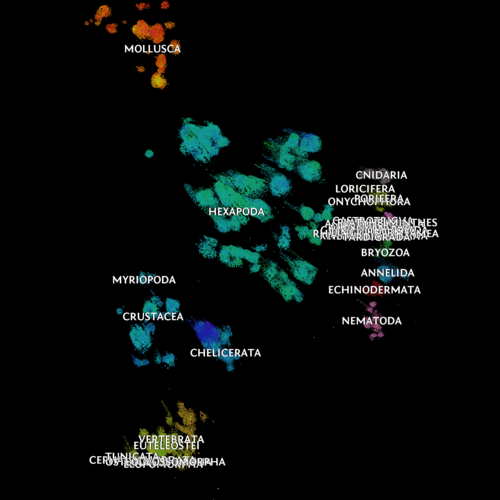
Note that this layout technique is not guaranteed to faithfully follow the hierarchical structure of the taxonomic tree. However, this relational structure should be broadly retained (i.e. the closer a pair of nodes in the layout, the more taxonomically similar they should be).
This isn't a final product by any means: there's plenty of scope for refinement. Label overlap is obviously problematic. Labels are currently rendered as part of the image itself: adding the labels dynamically as text elements would be a better solution, and would also allow each one to be hyperlinked to a corresponding taxonomic information page.
Update 2-Feb-2014: labels are now added dynamically, rather than embedded into the images. This also allows each to have a pop-up that links to images and information pages about the taxon. See the updated interactive demo.